

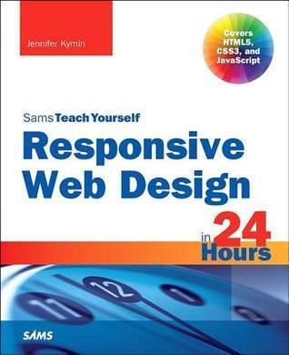
Description
This book offers a comprehensive introduction to responsive web design, guiding readers through the essential concepts of HTML5, CSS3, and JavaScript. By breaking down complex topics into manageable, one-hour lessons, it ensures that learners can effectively grasp the principles of crafting websites that adapt seamlessly to various devices.
The author, Jennifer Kyrnin, combines clear explanations with practical examples, making it accessible for beginners while still providing valuable insights for more experienced developers. Each lesson builds upon the last, allowing readers to progressively develop their skills and confidence in designing user-friendly, responsive layouts.
Readers will find themselves immersed in hands-on exercises that reinforce the material, culminating in the ability to create modern, responsive web applications. This structured approach not only promotes learning efficiency but also equips individuals with the tools needed to stay relevant in an ever-evolving digital landscape.
The author, Jennifer Kyrnin, combines clear explanations with practical examples, making it accessible for beginners while still providing valuable insights for more experienced developers. Each lesson builds upon the last, allowing readers to progressively develop their skills and confidence in designing user-friendly, responsive layouts.
Readers will find themselves immersed in hands-on exercises that reinforce the material, culminating in the ability to create modern, responsive web applications. This structured approach not only promotes learning efficiency but also equips individuals with the tools needed to stay relevant in an ever-evolving digital landscape.
Détails du livre
Format
Broché
Pages
373 pages
Langue
Anglais
Publié
janv. 1, 2014
Éditeur
Sams
ISBN-10
0672338386
ISBN-13
9780672338380